Sinclair jewelry rebrand
In any context, historical modern seems like a huge oxymoron. How can something be both old and new? It doesn’t seem to make sense, but when designing for a medieval-inspired jewelry brand, this is certainly a huge problem to consider.
That is what I ran into designing for Sinclair Jewelry, a local jewelry store that creates both recreations of medieval pieces and simple, delicate silver jewelry. Their previous branding was not only difficult to read, but could not be scaled well, and certainly wasn’t a very friendly feeling logo with sharp, exaggerated serifs.
For Sinclair, to really explore how to defeat their oxymoron brand, I found it necessary to explore various routes–word marks, letter marks, logo marks, and emblems. High contrast serifs and blackletter fonts could only check either my historical box or my contemporary box. At this point, I hadn’t figured out how to find a balance between the old and new, but I knew I would have to combine two elements. A logo for them wouldn’t work as just a wordmark. Many thumbnails and some digital iterations later, it came to me. Take inspiration from Sinclair’s jewelry designs!
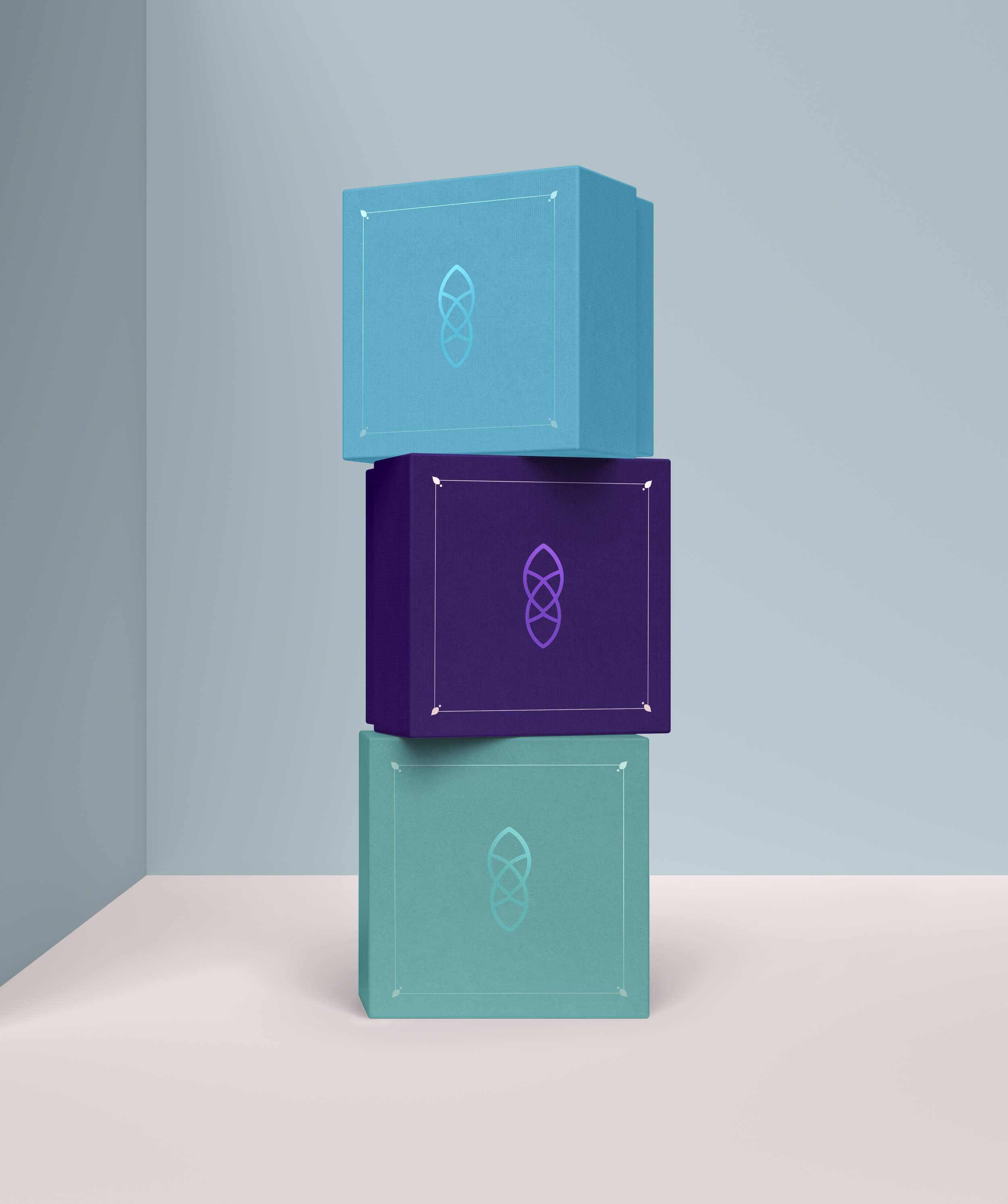
Inspired specifically by the shapes in a piece of their headwear that fit the delicate historical piece motif, I made a simple knot shape that I then attached to a crown base.
Many pieces of their jewelry take inspiration from a Celtic-knot style. This makes it obvious that they draw their inspiration from different historical aspects; however, many of these pieces are delicate and made with thin wire.
Because the crown fits their historical style, I chose a medium contrast serif font for “Sinclair” that was contemporary in its contrast. At the same time, the serifs help it from straying too far away from the historical side. The reason I knew this was the perfect font? The crown fit perfectly on top of the word, right onto the dots of the “i’s.” It was like it was meant to be.
The purple in the palette is a nod to their original logo, but I also spiced the color palette up with some other colors that complemented some common colors in their jewelry that could be used for different applications.
This new branding is more friendly, clean, and inviting to customers first discovering their website. It represents the beauty of their handmade jewelry. It solves the problems of being legible and scalable and gives a broader range of applications that it can be used for.
Most importantly, it perfectly fits the essence of their brand and their desire to make jewelry that can be worn day in modern times, while staying true to their love of history.


