Chow chow festival mailer
No matter who you are, food is a necessity. But food is better when it’s fun, and what’s more fun than a festival? And as much as phones and instant messaging are taking over, snail mail can still be an exciting way to get the word out about an event. This is why I designed a festival mailer for Chow Chow, a food festival in Asheville, NC.
To research the festival and better understand Chow Chow’s brand and mission, I went to the festival’s website. I was immediately drawn to the bright colors that correlate well with the idea of a food festival. The gorgeous food photography is also a stand-out factor in their festival aesthetic. Both of these being strong design choices that would attract foodies, who are the target audience for the festival, I decided to keep these elements of the brand’s design in my mailer.
The challenge of a foldable mailer, especially for a food festival?
Trying to figure out what would appear as you unfold the mailer.
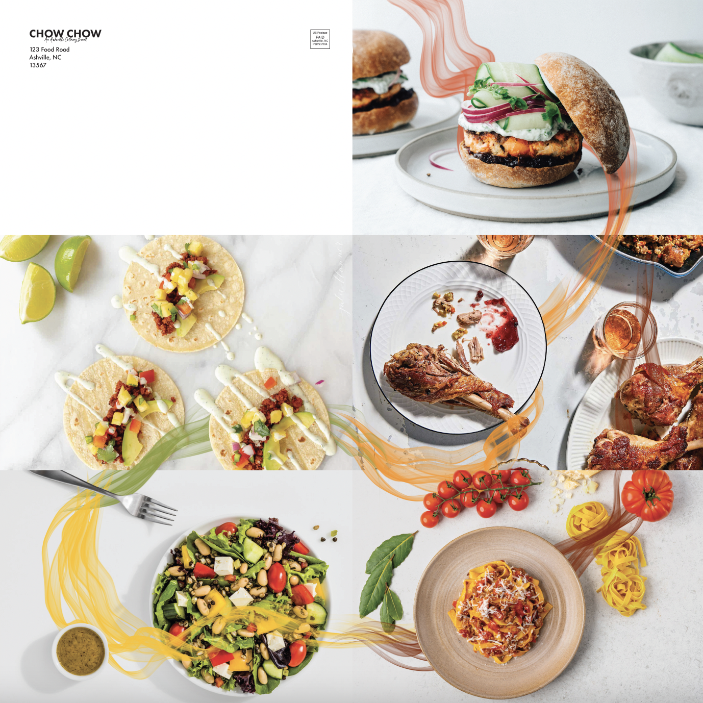
Most designs take the approach of having the backside as a poster, but that didn’t seem to fit a food festival. Instead, I wanted to use the back of the mailer as a series of delicious-looking professional food photography that would unveil as the mailer unfolds. To make sense of the imagery, I correlated the colors in the food photos to the colors of the panel it was next to. I prototyped the mailer and arranged loose photos to see the most visually appealing order. I also tested different variations of a smokey, color-changing line, that weaved on and off of the food in the images. This creates unity and further draws in the colors of the front side to the images on the backside.
Because I found the repetition of “Chow Chow” interesting, the opening page of the mailer is a pattern of the festival name to draw the viewer in. After that, the first two panels include a condensed version of the festival schedule so the mailer can be taken to the festival as a guide of events. The mailer design is accompanied by a unique, serving spatula shape with varying colors for different events at the festival and matching wristbands.
This mailer design succeeds at catching the attention of a foodie because of the stunning imagery and bright colors that entice hunger and follow the brand style. The design remains visually exciting throughout the entire experience, from the mailer to the novelty tickets and matching wristbands. All of these design decisions are meant to appeal to the reader and keep them engaged in learning about the festival and its mission through a more traditional medium.


